I was tasked with building a full visual identity for a three-month leadership program. Given a vague creative brief "make it camping themed" I took the lead and developed a cohesive brand inspired by Redwood National Forest.
This project wasn't just about aesthetics; it was a tech pilot for the company. I introduced Adobe Publish Online and AI-generated assets to the organization, creating a digital-first experience that was so successful it’s now being adopted for other internal initiatives.
The Highlights
The Role: Senior Graphic Designer (Solo)
The Challenge: Build a distinct brand for a long-term program that felt fresh but still lived comfortably within the Forvis Mazars umbrella.
The Win: Successfully broke away from our rigid global brand standards to create something unique, introducing interactive digital guides that replaced static PDFs.
The Strategy: Moving Beyond "Generic Camping"
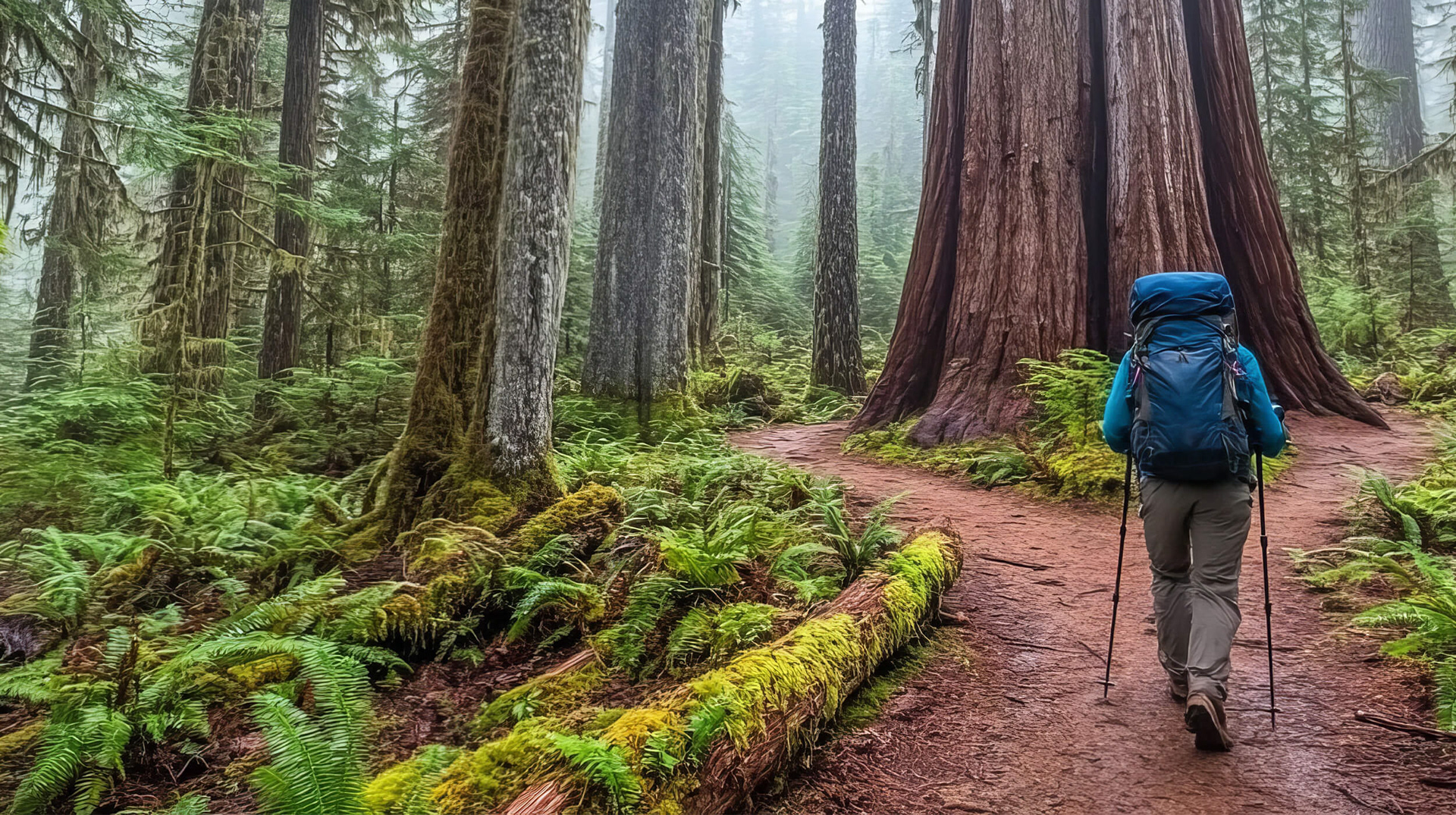
A "camping theme" can easily look like clip-art if you aren't careful. To give the program depth, I anchored the design in a specific location: Redwood National Forest.
Storytelling: Used the Redwood narrative to guide participants through their three-month "journey."
Scalability: Built a system that worked across everything from slide decks and coaching guides to custom achievement badges.
AI Implementation: Used Adobe Firefly to generate a custom library of thematic visuals, ensuring every asset felt consistent and high-end.
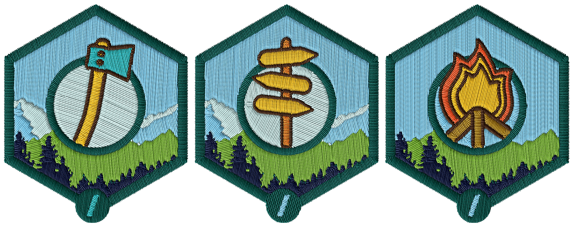
Custom track badges and scalable design system maintaining visual consistency across slide decks, coaching guides, and interactive forms
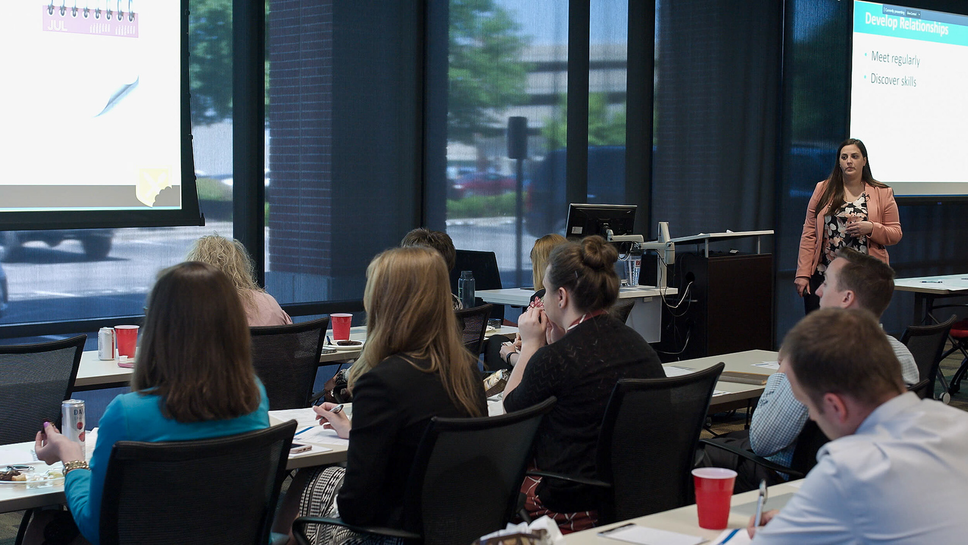
Adobe Publish Online interactive playbook with website-like navigation, introducing new digital format to the organization for sustained coach-participant alignment
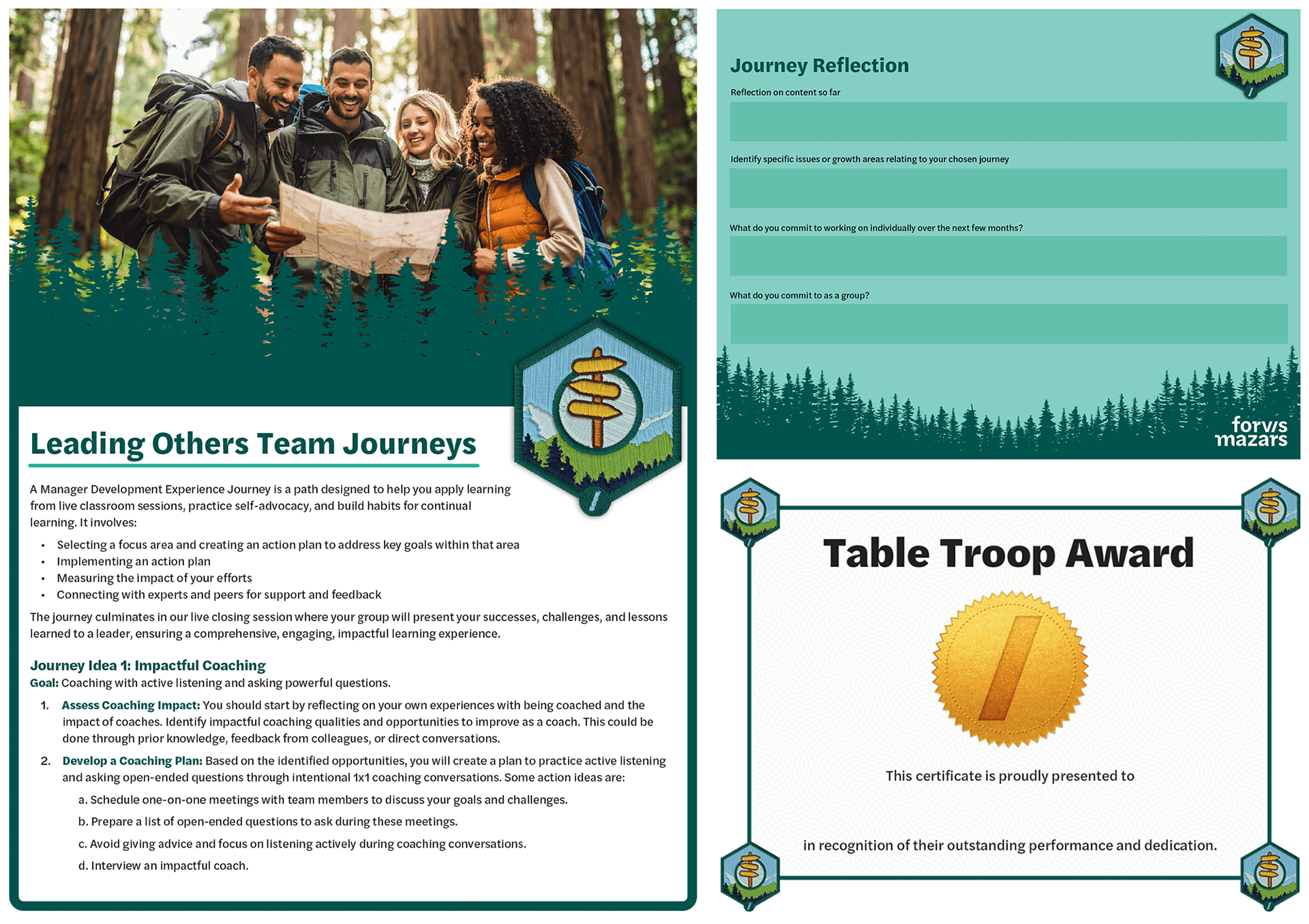
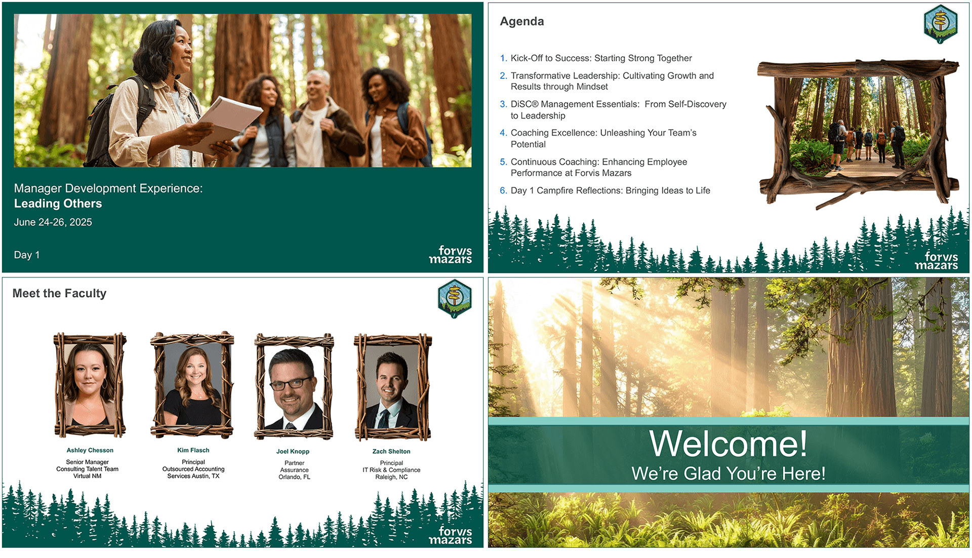
Leading Others program track materials featuring AI-generated assets and Adobe Publish Online interactive format - design system successfully adapted across two additional tracks (Leading Self and Leading with Business Acumen
The Tech Shift
I didn't just design the files; I changed how we deliver them. By introducing Adobe Publish Online, I turned standard program guides into interactive, website-like experiences. I even created animated demos to show stakeholders exactly how this new tech would improve the user experience—and it worked.
The Results
Widespread Adoption: The look and feel were so well-received that the organization is now using my workflow for other big projects.
Better Engagement: Participants and faculty finally had a program that felt "different" from standard corporate training.
Flawless Delivery: Managed the full suite of deliverables for three separate tracks, hitting every deadline for the live launch.
What I Learned
The biggest takeaway? Specific beats generic. By choosing a specific location (Redwood) rather than a broad theme (Outdoors), the design felt intentional and premium. Also, I found that the best way to get a big company to adopt new tech is to just show them how much better it looks in a real-world project.